Conversation / Maeve Redmond
Maeve Redmond on researching Valentines – Scotland’s most pioneering and successful commercial photographers, exploring their postcard designs, uncovering stories of the workforce and making new work in response that considers the culture of mass-produced print production.

October 2022
Founded in 1825 in Dundee, the family firm Valentines was once Scotland’s most successful commercial photographers. Best known for popularising the picture postcard, in the early twentieth century Valentines capitalised on developments in photography, printing and tourism to create a fascinating body of work and a vibrant industry in Dundee, quickly becoming one of the city’s largest employers. Developed in collaboration with the University of St Andrews, Sincerely, Valentines – From Postcards to Greetings Cards is a partnership between Panel and V&A Dundee that uncovers the story of Valentines, bringing together the disciplines of photography, illustration and print design. The exhibition features original artwork and greetings cards alongside printing plates, historic postcards, promotional company magazines and booklets from the James Valentine Photographic Collection, part of the unique archive held at the University of St Andrews Libraries and Museums.
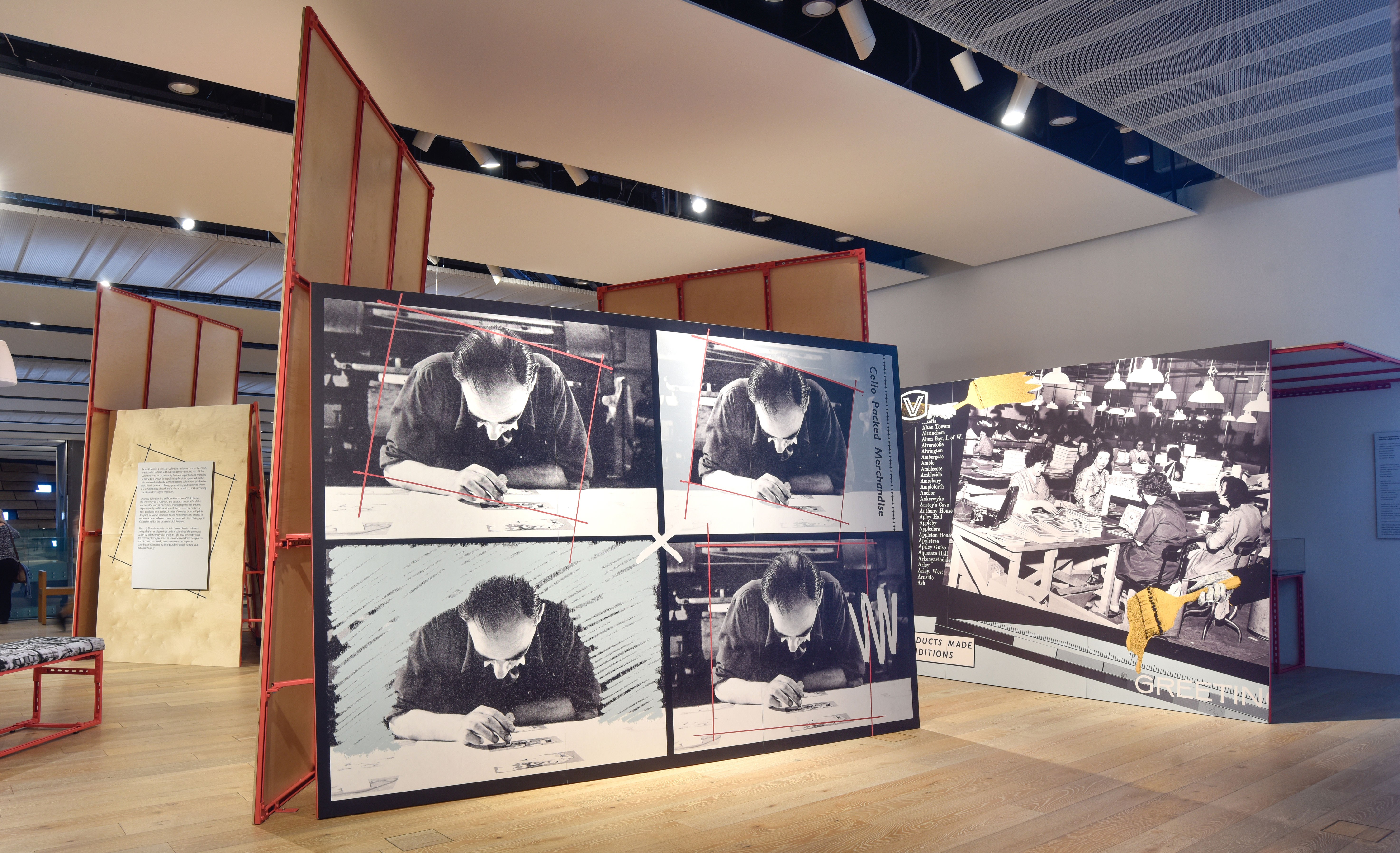
Central to the exhibition is a new commission by graphic designer Maeve Redmond and a film by artist Rob Kennedy. Redmond’s seven image-based collage works reference the topographical landscape postcards for which Valentines were renowned and foreground archival photographs of the ‘factory floor’ and the people that worked at Valentines, highlighting their important contribution to Dundee’s social, cultural and industrial heritage.
From your initial visit to the James Valentine Photographic Collection at the University of St Andrew’s, what were the objects and images that immediately sparked your interest?
We were kindly given a tour of the vast collection of material within the archive, which included hundreds of thousands of postcards documenting every single town in the UK and Ireland. This left me with a real impression of the importance of the company to the development of the postcard as a cultural artefact. What really intrigued me, however, was a couple of boxes of ephemera that related to the working life of the employees of the company. These boxes contained photographs of the factory floor, internal newsletters and catalogues advertising their work. It was fascinating to get an insight into the factory, the people that worked there, different departments and the way it evolved with technology over the decades. Such ephemera also illustrated changes in photography and print in the twentieth century and instigated my thinking on the themes of work and leisure, place and identity. In my commissioned work I am keen to respond to the social histories of the place the work is being exhibited, so working with the archive to draw upon Dundee’s design and print heritage was really exciting.
Your photo-collages offer a window into the Valentines factory floor and the many hands and technical stages involved in the design and manufacturing process. How did working with the stories of former Valentines employees help to inform the behind-the-scenes narrative present in the work?
From our early research into the archive, it became apparent that what was missing from the recorded history of Valentines was a record of its workers. The idea was to turn the gaze from Valentines’ output of scenic postcards, towards the inner life of the factory. I was drawn to a comparison and conflation of ‘found’ factory floor images, which included staff at work, and the many multiples the archive holds of the romanticised British pastoral landscape. Dundee has such a rich industrial history of ‘jute, jam and journalism’, but Valentines has not been remembered to the same extent within this narrative. This is despite the company having employed thousands of people up until its relatively recent demise in the early 1990s. Many former employees still live in the city and we were fortunate to have a good response to a call out to people willing to share memories of their working lives with us. It became apparent through this work that the commission should celebrate both the output of Valentines and the community of people that worked in the factory.
Can you tell us what technical devices the postcard format offered you and in what ways you chose to adapt and play with it within the exhibition?
The seven works are full of visual references to the designs of both postcards and greetings cards. I was interested in the various formats and graphic devices that the postcard and greetings card designers at Valentines used. For example, the four-part window device they employed to show multiple views of one town on a single postcard – I used this in one of the works to replicate the repetition of print and the artist at work. It seemed obvious but also important to work with the format of the postcard for the work, its simplicity and the universality of its proportions. I was interested in thinking about varying scales and physicality within the constraints of this standard proportion. Distinct framing devices were widely used across Valentines’ postcard and greetings card designs, which I have also referenced in some of the works. The colour palette is inspired by the shades used in early twentieth century hand-coloured photography. There are also several other visual references to workers’ hands and the manual nature of the cards’ fabrication, as well as my own hand-drawn markings layered over sections of the work.
Did you make any surprising discoveries about any of the design handiwork during your research and if so, what impressions did they make on you and your work for this project?
Two of the key items we discovered in the archive were self-published catalogues that promoted the work of the company at two different points in its history. The first documents the peak of postcard manufacture in the 1900s, detailing the departments involved in such production. The second is a mid-century promotional catalogue romanticising the development of greetings cards – which became the company’s main business. Both catalogues reveal explicit gender divisions on the factory floor. Men oversaw machines and most managerial roles. Women made up the departments of ‘delicate’ work, such as folding or applying decorations. As they had not been in managerial roles in the company, many of the women we spoke to didn’t think their stories would be interesting to us, when in fact the opposite was true.
What is the intention behind the interplay between text and image in the works?
All of the typography and language in the work was found in the archives and by using the selected language in Valentines’ own typography, I hoped to reflect the aesthetic style of the factory at different points in its history. I wanted to incorporate the varied ways that Valentines promoted itself and how it romanticised the inner workings of its factory so I selected text that would pair with images to bring to life a narrative of the factory f loor. Through this use of text and image together, I wanted to explore the relationship between the factory floor and the holiday, between work and leisure, drawing attention to Valentines’ rise as a postcard producer during the advent of nationwide holidays, the growth of tourism and increased opportunity to travel in the aftermath of the industrial revolution.
You worked alongside Rob Kennedy, who designed the exhibition scheme, to create new work that imbues the look and feel of Valentines during its heyday. What kind of themes or conversations cropped up between you both during the development of the project, and how did your ideas overlap?
The exhibition uncovers the story of Valentines, bringing together the artforms of photography and illustration with the commercial culture of mass-produced print design. My series of oversize ‘postcard’ prints responds directly to archival material, but also combines with Rob’s exhibition design to form the physical exhibition itself. The design had to respond practically to exhibiting requirements – for example, the necessity of a darker space to contain the display of archival material – and to the scale of the V&A Dundee’s interior. Rob and I decided that my work should be large enough in scale to form the walls of the exhibition, so that archival material could be displayed within the interior. Walking into the museum, you can see the exhibition from a distance, so we wanted the work to be visible and ledgible, to draw people in to discover the archival material, which is all quite small in scale. In addition to this, we created a curtain to cover the window. I chose a photograph of the factory floor and enlarged it to over eight metres, so that the people in it are life-size. Consequently, our approach resulted in an exhibition that works like a theatre set, and we hope it brings to life the internal atmosphere of Valentines.
Maeve Redmond (b. 1989, London) is an independent graphic designer, based in Glasgow. Redmond’s research-led practice ordinarily begins in the archive and is shaped and responsive to context, thinking through a site’s design history to create two-dimensional work. Commissions and exhibitions include; Edinburgh Art Festival (2022), Scottish Design Gallery, V&A Dundee (2018-2022), Edinburgh Sculpture Workshop (2016), Tramway, Glasgow (2015). She works primarily with artists, writers and cultural organisations to produce publications, promotional campaigns, visual identities and websites. She collaborates extensively with curators, artists and writers to exhibit commissioned work that results from her design practice. maeveredmond.co.uk
Sincerely Valentines – From Postcards to Greetings Cards is a free exhibition in the Michelin Design Gallery in the upper foyer of the V&A Dundee Museum. On now until Sunday, 8 January 2023.


